 Overview
 Our philosophy is to flag (not remove)
suspect data at the parametric level
The RVSMDC system uses both
automated and visual data inspection
Automated flagging
- Pre-process for realistic ranges, time sequence, etc. (see handbook)
- New statistical spike/step flagging tool
Visual inspection completed using
VIDAT (VIsual Data Assessment Tool), a software tool developed
in-house (see handbook)
- Visualize multiple data streams
- Map positions/climatologies
- Check automated flagging
- Analyst adds additional flags
Upon completion of QC, the RVSMDC
provides feedback to vessel operators
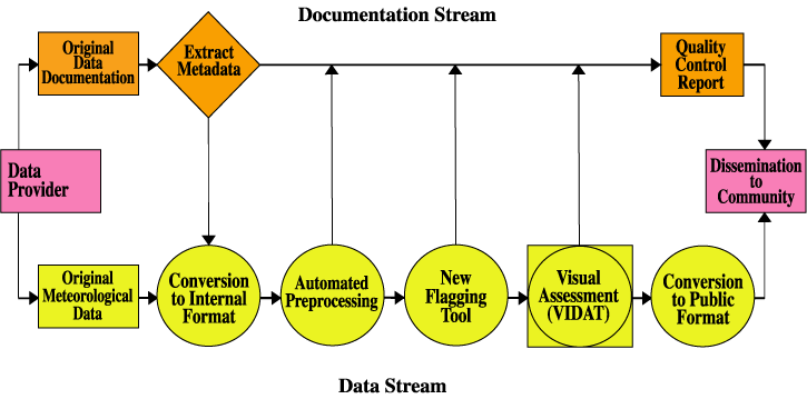
Data flow begins with original
data and documentation being combined into a single file (netCDF format)
Output from each QC process (flags)
combined into data quality report
Report and value-added data (with flags)
released to public
New automated procedures have
been developed to flag systematic errors
- Based on analyst experience using VIDAT
- Greatly increases QC efficiency (less analyst hours per vessel)
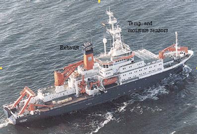
Example: Stack exhaust impacts
- With certain ship-relative winds, exhaust influences temperature and humidity measurements
Visual QC identified increases in air
temperature when ship-relative winds are near 180 degrees (from stern)
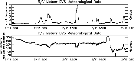
Using earlier QC system, the analyst
manually flagged suspect temperatures
Today, our QC system takes advantage of
automated identification of suspect regions
The new automated detection
algorithm identifies and flags spikes, steps, and statistically suspect values
- The method examines the difference in near-neighbor values
- Flags are assigned based on a threshold derived from observations
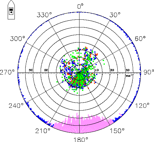
Graphical representation of the flagged
values identifies flow conditions with severe problems
- Flags (red = spike, blue = suspect, green = step) are plotted as a function of ship-relative wind
- The percent flagged in each wind bin is shown on the outermost ring (pink represents > 7.5% flagged)
The analyst then determines a range of
data to autoflag (For the Meteor, 145 - 210 degrees was chosen)
Flagging all values in the range
determined using the polar plot is preferred, since one cannot be certain that realistic
looking temperature values are accurate when the wind is relative to the stern for the
Meteor
Analysis has shown the final result to be
similar to analyst-added flags, but with substantial time savings
| Analyst manual visual flags | 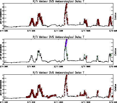
| |
| Flags applied by statistical auto-flagger | ||
| Flags assigned to suspect ship-relative wind directions |